Listen to this article
Fashion trends may be fickle, but colour analysis insists your palette is for life. For Luxembourg-based Melanie Reuter, the practice is drawing a growing clientele – and turning a passion for drapes and undertones into a thriving side business.
This article is made available to you for free as part of our Advent series. If you want to support our team, subscribe now.
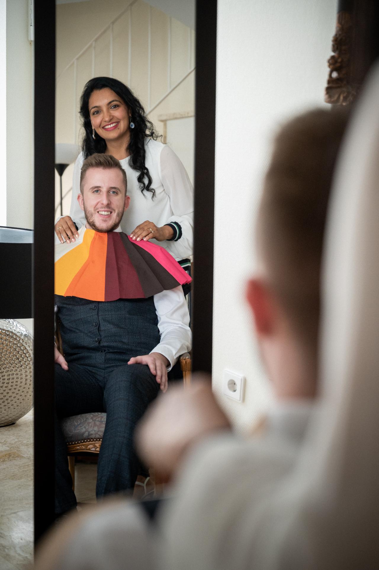
"You see, this palette here yellows her face." Melanie Reuter puts a warmly-coloured flag over Stefania Glezos' shoulder. "Whilst this one livens it up." She folds a cool flag in various shades of blue and purple across the other shoulder. Then she picks up two drapes: one in a cool grey, another one in a warm beige to strengthen her point. More drapes and flags, more direct comparisons. Sometimes we immediately see her point, sometimes we struggle to see the exact difference – yet, Melanie knows what she is talking about, pointing out that one set of colours define the jawline more than another, and her comments are met with enthusiasm by Stefania, who, as we learn, has been typed a so-called 'true winter'. Her palette consists of cool, highly-contrasted colours, uninfluenced by autumnal warmth (which would turn her a 'dark winter') or spring's lightness (which would turn her a 'bright winter').
What's usually important before starting a session: Clients should wear no makeup, no jewellery, and have no dyed hair – if the latter is the case, the head has to be covered during the analysis. Melanie herself wears a white cape to avoid influencing her reading of clients' undertones. One such 90-minute costs 120 euros. "It is a one-time investment. It last for life, your season doesn't change. So you can adapt your shopping habits gradually", Melanie says.

Melanie Reuter


Stefania Glezos
The magic happens on weekends and twice per week in a small, lovingly furnished and decorated studio in Melanie's – or Mella's, as she prefers calling herself on social media – flat. Since May this year, she has professionalised her reading of people's colours as a side hustle next to her full-time job, after two years of independent practice. "Once I began posting about it on social media, it really took off. In just the past two or three months, it's been crazy – I only properly started in May, and since June or July I have been fully booked every month." That strikes us as no surprise, considering the wide-spread popularity the self-optimisation trend has been enjoying all over the world throughout the past years.
In multicultural Luxembourg, Melanie gets to analyse a wide range of different types, much to her own pleasure: "I love how diverse it is here in Luxembourg. In some countries, because people culturally tend to share similar features, you get a lot of the same season. Here, it's much more varied – I have seen pretty much every type." Her clientele varies a lot in terms of age too: she chronicles having done a good 100 of such analyses by now, for people – mostly women – aged from 16 to 70. "Since the sessions cost a bit of money, they're usually booked by people already working." She would advise against doing teenagers analyses. "Because their features are still changing and developing."
From Victorian periodicals to global industries
Linking appearance to colour choices has a long backstory. As early as the Victorian period, magazines and periodicals provided prescriptive lists of what hues should be worn, usually tied to factors such as complexion, hair colour, age, or social standing. Specific sets of rules were permeated: If you were young, you were supposed to wear bright colours, wearing pale greens would go well with so-called 'good complexions', and magenta, considered as an atrocity, should be suppressed altogether. Miss Oakey's Mysteries of Artistic Costume (1881) is, as a detailed guide, one example that was widely circulated and reprinted in periodicals of the time.
Colour analysis and self-optimisation
-
Colour analysis fits neatly into the ever-expanding world of self-optimisation practices – so, the tools and habits designed to help people refine, measure, and improve themselves over time. Just as wearable tech and health apps track physical metrics, or productivity systems like time-blocking and task-tracking promise sharper cognitive output, appearance-focused methods such as colour analysis fine-tune how we present ourselves.
With its structured approach – swatches, draping, seasonal palettes – it sits right between quantification and self-branding. Testing which shades enhance or diminish, then aligning clothes, accessories, and makeup to project a consistent image. Like sleep-tracking or wellness apps, it's less about overnight transformations than about gradual adjustment, framed as an investment in a more harmonious, confident self.
Dr Anne-Marie Millim, who specialises in Victorian Literature, life writing and non-fictional genres at the University of Luxembourg, points us towards Alexandra Loske, an art historian, writer and curator who takes an interest in colour in Western art and culture. "She calls the Victorian Age as very fundamental in the colourisation of the world", she points out. "In 1810 chrome yellow was invented, then French ultramarine in the 1820s. These inventions were ways to find out how to produce colour industrially and cheaper than before. Of course, that set the tone for what was available, which then informed fashion."
Dr Millim cautions against imagining Victorian women as simply obedient to rules printed in magazines. "Women's magazines weren't exclusively concerned with that type of thing, " she explains. "They had a lot of articles on more intellectual matters, arts, politics, and the like – even if there is an omnipresent interest in what to wear, it is not the only concern." Albeit somewhat prescriptive by nature, these comments were often to be taken "with a grain of salt." Even in areas like makeup, typically frowned upon for association with theatre or prostitution, women would quietly adopt powders and blush to create a subtle, "healthy" look. "It was not meant to be obvious", Dr Millim says, "They would put on cold cream and then a facial powder, which was usually either white or rose-toned. It was meant to look barely perceptible."
"I think for many people, it helps them make better choices. Instead of buying something impulsively and later realising it doesn't suit them, they choose pieces they'll love long-term."
Melanie Reuter, colour analyst
In the 20th century, colour analysis started reappearing in new forms. Suzanne Caygill, a designer and colour theorist, had been working on personalised colour palettes since the 1940s and would later publish Color: The Essence of You in 1980 – the same year in which Carole Jackson's Color Me Beautiful popularised the simple four-season-version people continuously refer to today. She also established Color Me Beautiful Inc., which trained consultants and helped develop variations on the seasonal approach. Training programs in that era were a significant investment: Jackson's two-week course cost about 3.500 dollars, while similar companies offered longer trainings for 5.000 dollars, with additional fees – sometimes up to 10.000 dollars – for access to the full set of colour cards used in client consultation.
Trainings, tools and myths
Today, Karen Brunger, founder of the International Image Institute – a company striving to "transform appearance, behaviour, and communication" – counts as a gold standard for colour analysts in the making. Melanie, too, underwent her first colour analysis qualification there. The online Qualification program teaches the 16-season system and provides virtual mentorship, practice on a client, and lifetimes access to training materials, but excludes in-person coaching. "In November, I am also flying to Toronto to complete the Master training with other colour analysts and with Karen in person. That way I can repeat everything live and under professional supervision." The Mastery program – for more or less 1.800 euros – includes an expanded 23-season system and takes three days to complete.
The dizzying amount of colourful tools and drapes used by Melanie are also sourced from the International Image Institute. The website points us towards a list of 117 items in total to choose from, from reference guides to colour dimension and palette assessors, colour drapes, flags, lipstick assessors, hair fringes… A pricy investment, Melanie admits. "With training, materials, and setting everything up, I spent around 5.000 euros. But by now, I have earned everything back."


Melanie explains to us that a lot of myths and false assumptions around colour analysis are circling around. "The only reliable method is to test how different colours reflect on your face." We question her about a trick we have come across over and over again online: the vein-test (i.e., if your veins are on the green side, you might be a cool season, namely winter or summer, and if they appear blue, you should be a warm season, so autumn or spring). Melanie shakes her head. A myth, she says. "There are a lot of such myths. For instance, that anyone who tans easily must have a warm undertone. Not true. Any skin tone can be warm or cool. Or the idea that eye colour determines your season. It doesn't. Sometimes there are correlations, but it's no exact science." She pronounces that at the end of the day, it comes down to three factors: undertones, lightness, and intensity.
Seeing (and shopping) with new eyes?
Stefania initially did not intend to ever get her colours done – yet, curiosity did not kill the cat when Melanie asked her friend whether or not she would like to have her colours done. "At the beginning, it was difficult for me. Melanie didn't tell me what my palette would be straight away. She let me take part in the process, showed me different drapes, asked me about what I think… First, I had no clue, and often I was completely wrong", she admits with a shrug. "Simply because I preferred a colour to another. It is hard to separate whether a colour actually suits you, or if you just like it well." Only after going through the process several times and having compared the full palettes side by side, the cognitive dissonance softened and it dawned on her that she might not be an autumn, but a winter. "See, what also confused me was the classic stereotype: dark hair, brown eyes, and darker skin must equal warm tones. So I just assumed that might apply to me, too."
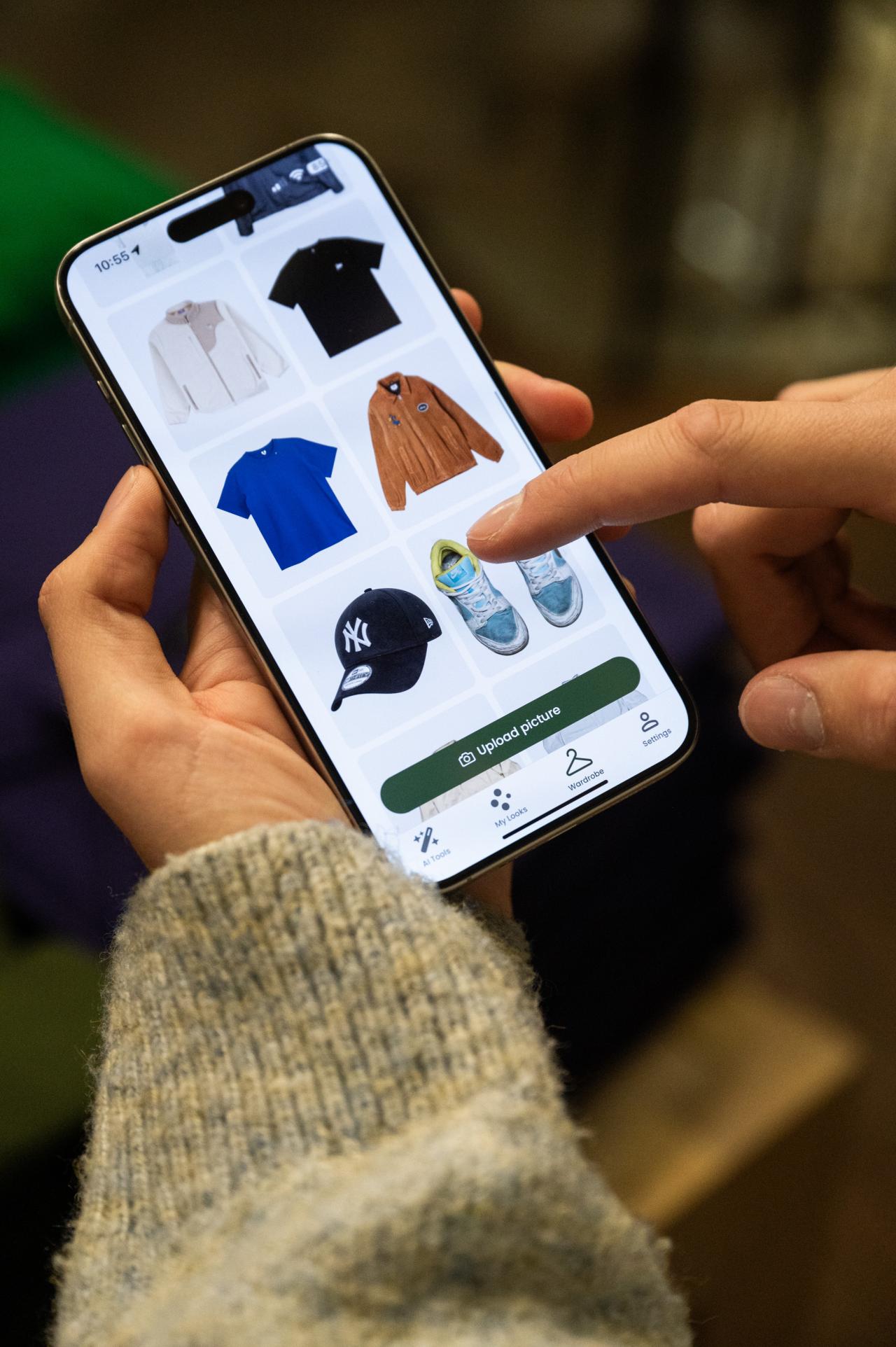
Since then, she has been shopping differently. "Since I did it, I definitely look for clothes in those colour tones. For example, I bought this jacket, " – she points to the bright pink cardigan she was wearing earlier – "straight afterwards. It's not like I was only wearing the 'wrong' colours before. But I did realise there were a few jumpers or tops that didn't really suit me at all. I still wear them because I like them – and that is fine. But now, when I go shopping, I automatically pay more attention to the right colours. My brain filters things differently when I'm scanning through the racks."
Apart from tops, she figured out that jewellery – she now wears mostly silver jewellery – and glasses can make all the difference, too. She tells us about an old pair of glasses she had but sadly broke. Despite having bought a new, tortoise-shell coloured pair, she barely ever wears them, opting for contacts instead. "After my session with Melanie, I realised why. They didn't suit me. A few weeks ago I started looking for new frames, and I understood: I should go for silver, white, or black-and-white. My old favourite pair was black-and-white with silver details, and I had worn them constantly." With these old glasses, she rarely ever put on makeup, still she would usually look "fresh". Whereas with the brown tortoise-shell pair, "I felt washed out and needed makeup to compensate."
Much like today, historically speaking, the balancing act was about visibility without excess: enough colour to be noticed, but not so much as to appear "flamboyant". Colours, textures, and styles, as Dr Millim puts it, "are always affected by industrial and social imperatives." More colours create more needs. She reflects: "Maybe we think there is more room for uniqueness today. And yes, I think that is the case. But it is also today about being proper. You still do it because you want to look awake and healthy enough, friendly enough. Today it's still heavily tied to ideas and feelings of propriety."
"Now, when I go shopping, I automatically pay more attention to the right colours. My brain filters things differently when I'm scanning through the racks."
Stefania Glezos, former client of Melanie's
Does colour analysis influence consumer behaviour in the long run? "I myself still like shopping too much, so my habits haven't drastically changed. But I think for many people, it helps them make better choices. Instead of buying something impulsively and later realising it doesn't suit them, they choose pieces they'll love long-term. That makes it more sustainable, in a way", Melanie says. "It's unrealistic to only have the right shades in your wardrobe. But it does help to understand nuances." She clarifies – to her, analysing someone's colours is not meant to make anybody feel bad about themselves and their choices. She always frames her recommendations positively, making sure her clients are aware of the agency they have before forwarding their reports to them. And: the focus always lies on the face. "If you want full harmony, you can apply this everywhere. But the most important area is near your face. What you wear on your torso is what makes the biggest difference. Hair colour makes the difference, too – if it matches your undertone, you won't look pale or washed out. But trousers don't affect your face." At the end of the day, Melanie and Stefania agree, it's about making people feel like the best possible version of themselves.